Spotlight
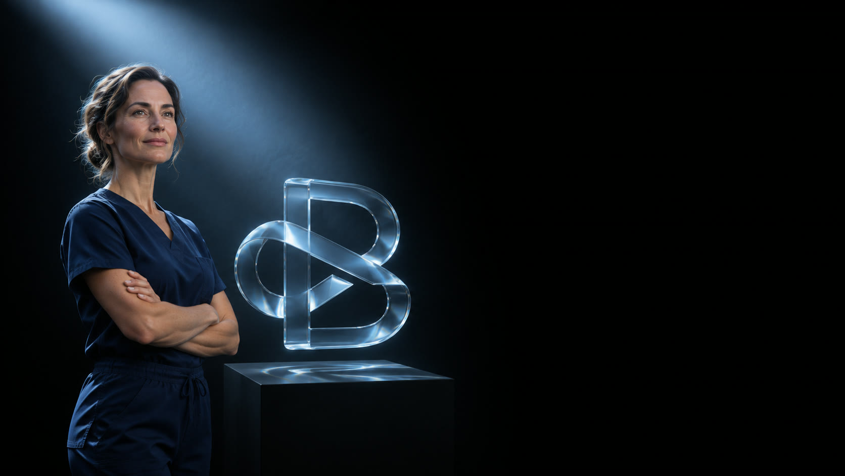
RecommendedDark and cinematic. The blue light beam from the BrandRX brand sheet picks out what matters.
How the page works
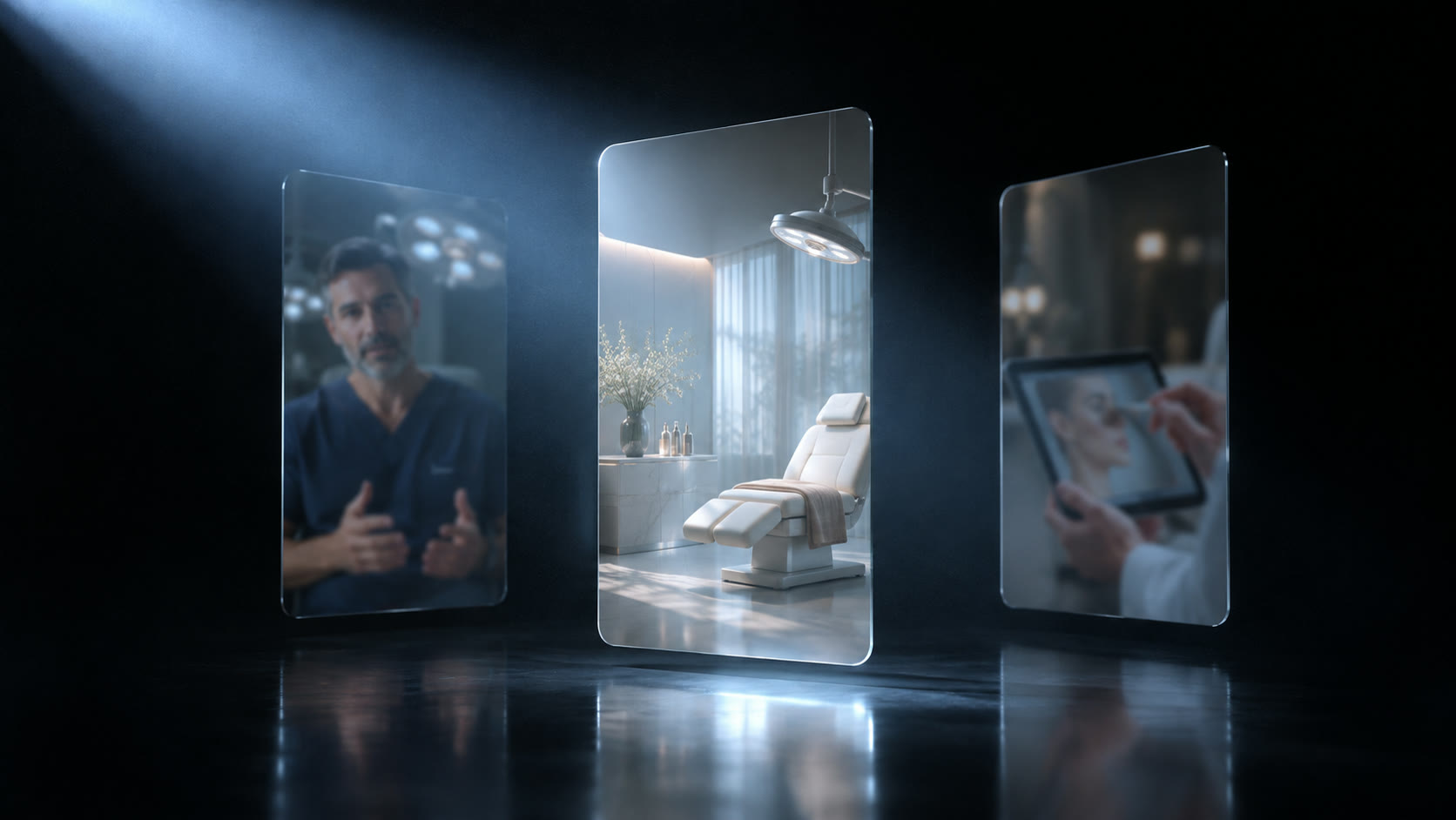
The beam lights the clinician first, then the proof, then the booking button.
Signature moments
The beam fades up on the clinician as the glass B turns. On Work, the panel the beam lights plays its film.
Why pick it
Closest to the current BrandRX deck and colours. The most premium feel, with video at the centre.
Risk
Dark sites can feel heavy. We add one light grey section on every page.
Prescription
Light and editorial. Grey paper, black ink, pale blue accents.

How the page works
The site reads like a consultation: diagnosis, the plan (our services), results (cases), then book.
Signature moments
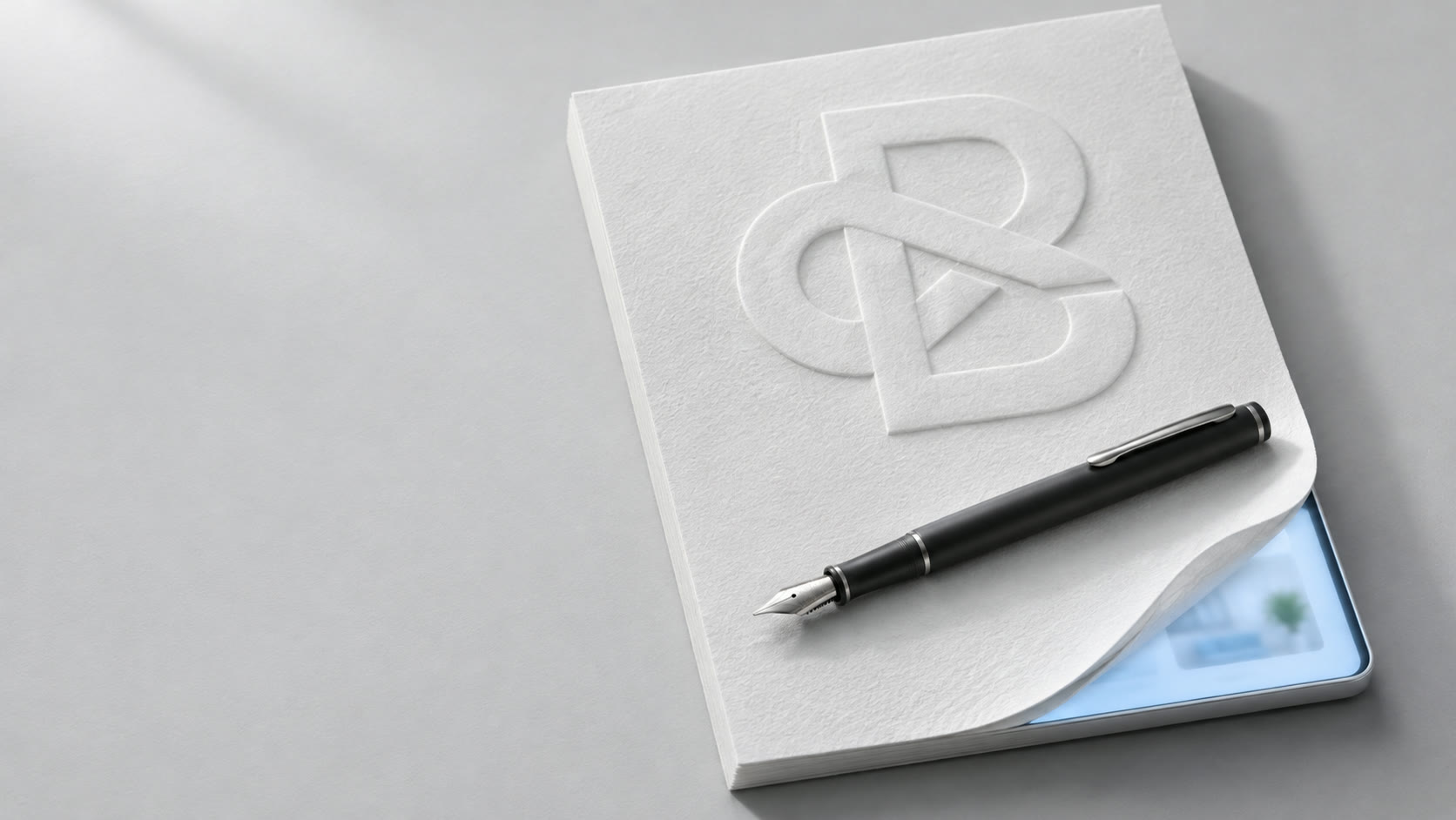
A pen writes the clinic's plan, then the top sheet lifts to show a case film. On Work, files open and play.
Why pick it
The story leads straight to booking. Calm and easy to read.
Risk
The prescription idea can turn cute. We keep it to one object.
Clinical Light
Bright, calm luxury with real clinic photography.

How the page works
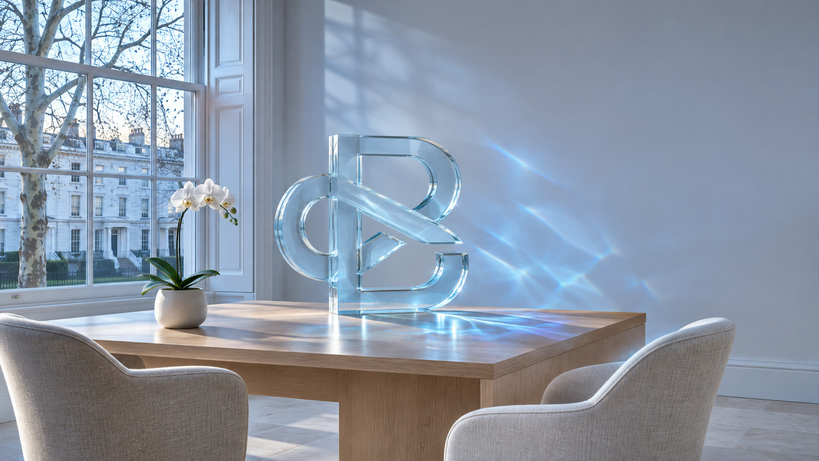
Shows how a clinic feels when its brand is right. Light from the glass B points to the proof and the button.
Signature moments
Morning light passes through the glass B and settles on the wall, once. A clinician explains while a case film plays.
Why pick it
Closest to how premium clinics present themselves.
Risk
Calm can look ordinary. The light has to do real work.